|
Types of Type
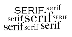
Serif
Serif typefaces have little lines (or feet) attached to the ends of the strokes of the characters. Serif fonts are easily legible since their feet lead the eye to the next letter. They are mainly used for body copy in large blocks of print material. They also look the worst reversed since the fine detail isn't perceived.
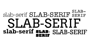
Slab-Serif
Slab-serif typefaces are serif fonts with thick, bold feet. They work well in headlines and can work in body copy blocks. They look good in reverse type and are perceived well on screen.
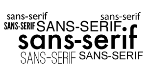
Sans-Serif
Sans-serif typefaces are modern, contemporary fonts without the serif details on their characters. Their strokes are a constant thickness. They look good reversed and are the most legible font for online. In print, they are best for headlines or small snippets of text.
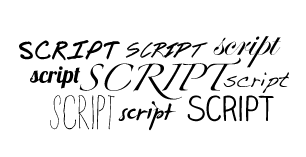
Script
Script typefaces are based upon handwriting and have very fluid and flowy characters. Formal script fonts are more reminiscent of type used centuries ago, where as casual script fonts are more similar to modern handwriting. They can be very difficult to read and should be used sparingly.
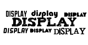
Display
Display typefaces are the broadest category and include all the types that are unsuitable for body copy. They are reserved for headlines due to their creativity and uniqueness. They are used to draw attention and have a wide array of feelings and emotions they evoke.
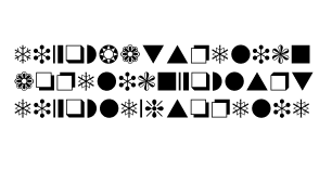
Dingbats
Dingbats are specialty typefaces that consist of symbols and ornaments instead of letters. Many are created around a particular theme.
Emotions of Typefaces
It is important to realize that certain typefaces create certain moods and perceptions. Serif typefaces are traditionally more traditional and old-school. Sans-Serif typefaces are more modern and contemporary. Slab-Serifs can be very dramatic and in-your-face. Script typefaces are very formal and proper - since they are mainly used for weddings and invitations. Display typefaces range so widely that they can evoke any feeling. Typefaces can be formal, fun, quarky, edgy, intense, cute, masculine, feminine,classic, heavy, light or even just neutral. The options are endless.
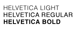
Weight
Weight refers to the thickness of the type. Weight can be thin, light, medium, bold, heavy or black. Changing the weight changes the essence of the type. Heavy, bold types dominate and call for attention. They create drama and emphasis. Thin, light types are subdued and timid. They can be overshadowed by bigger elements.
Style
Style is a different set of characters for a typeface. Styles can be oblique, italic or small caps. They can create movement and motion in the type. They affect the rhythm and pace of the type. |
|