Typography LingoTypeface:A group of characters (letters, numbers and punctuation) that share a common design or style. Examples: Times New Roman, Arial, Helvetica and FuturaFont:The mechanical way the typeface is made - can be digital, hand-set, machine-set or phototype. All fonts that are created are of a typeface.Type Family:The different options available within a typeface - Bold, Italic and morePoint:The size of the font. 1 point = 1/72 inch.Serif:A typeface that has lines at the ends of the strokes of the characters - aka the feet. Serifs make fonts easier to read since they guide the eye to the next letter.Sans-Serif:Without serif. A typeface that has no feet on the characters. They are easier to read on a screen and better for bigger blocks of text when used in print.Pica:A measurement for lines of text. 6 picas = 1 inch. 1 pica = 12 points.Tracking:The spacing between the characters in a block of text.Kerning:The spacing between two individual characters.Leading:The spacing between lines of text. Positive leading spaces the lines out and negative leading makes the lines overlap.X-HeightThe height of a typeface's lowercase x and usually the height of the body of all lowercase letters. It doesn't include ascenders and descenders.Baseline:An imaginary line where all of the characters of a typeface rest.Alignment/Justification:The positioning of text within the page margins - flush left, flush right, centered, justified.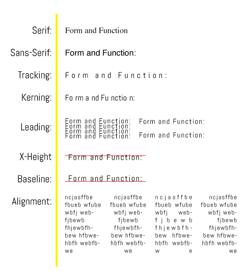 |
|